Thursday, June 14, 2012

Geo7 Lab 8

(The Big Picture)

The 2009 California wild fires was a series of 63 wildfires, that burned "more than 336,020 acres of land starting late July through late November" (Wikipedia). The station fire, north of Los Angeles county, was the largest and deadliest. It had destroyed 89 homes, 209 structures, and tragically claimed the life of  two firefighters (Garrison 2009). Nearby communities were strongly affected by the fire, and some of them were forced to be evacuated due to the severe condition. I was living in Arcadia during the station fire, and I can still clearly remember the smell in the air and the heavy smoke in the sky. The picture below is what Mount Wilson looked like on September 1st, 2009. My house and school were right underneath the mountains. I remember seeing the fire on every news channel everyday, fearing that the fire will continue spreading and affect me and my family. Fortunately the fire was 100% contained by the end of the day on September 16th, after spending 93.8 million dollars on firefighting . 

(The Big Picture)


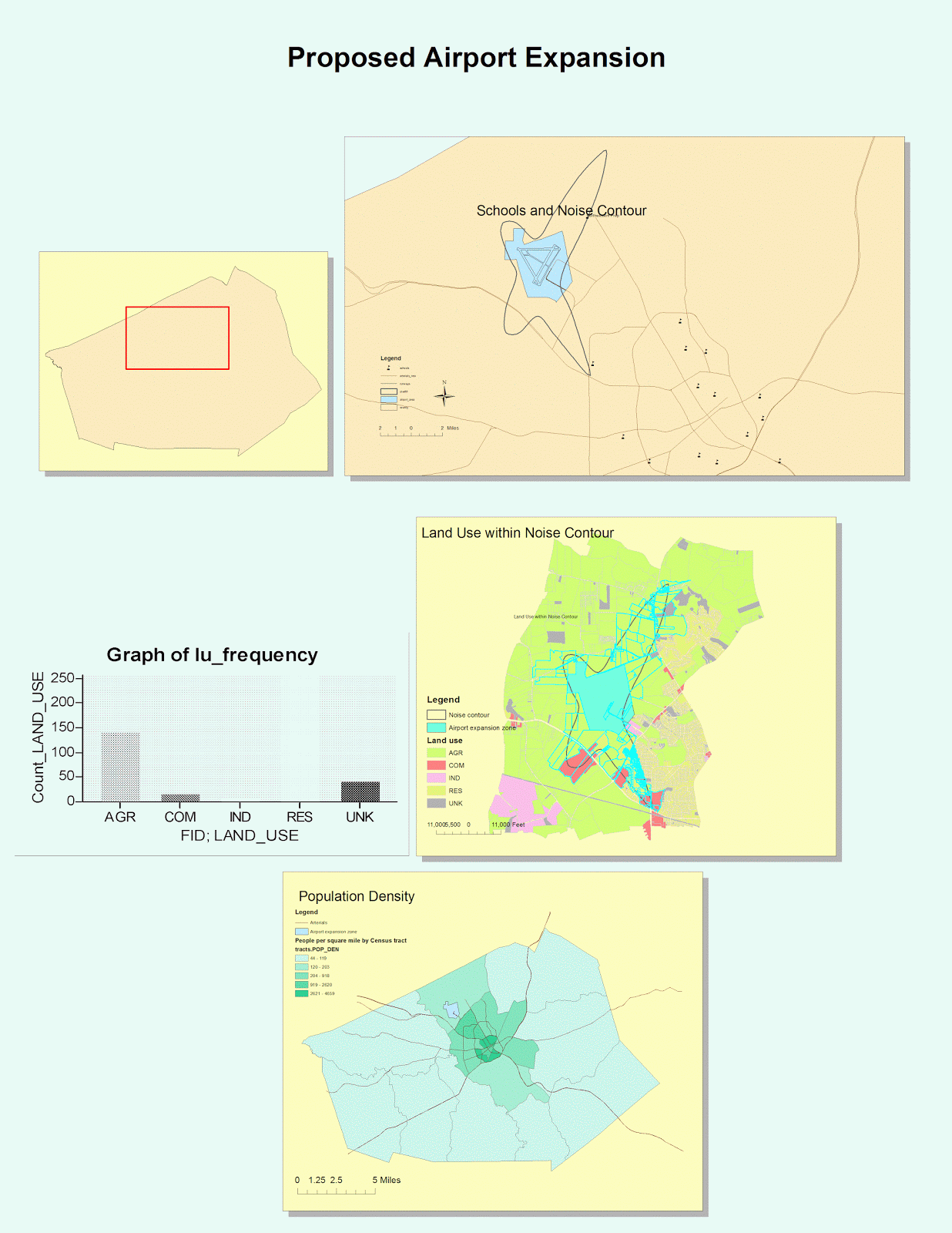
Our final lab for this course is to reflect this incident through GIS maps and analyze one aspect of the station fire by studying thematic maps that we created. By now we are very familiar with different tools in Arc GIS and different sources to download data. While collecting data for this project, it kept on reminding me that  the affect of the station fire is tremendous and horrifying. Therefore I decide to do my report on how the station fire affected nearby communities and major parks of Los Angeles County. Below are my reference map and thematic maps. 
 
(Reference Map Station fire 2009)

The reference map shows the growth of the station fire from August 29th through September 2nd using colors ranging from yellow to dark blue. Fire on August 29th is indicated by yellow, and it was spreading so rapidly that the area was more than 10 times bigger on September 2nd. I also included the three major national parks in LA county, in which the Angeles National Park was severely burned during the fire. The major Highways of LA county is also shown on the map with orange lines, and we can see that a few of them actually went through the station fire area resulting in the closure of multiple Highways during the fire. From the map we can see that the fire was spreading towards the North, and this was due to the wind direction from late August to late September which was North and North West (Station Fire 2009). In the next two maps we are going to see how the surroundings were affected by the station fire.  

Thematic Map 1

The first thematic map indicates the affect of station fire on populated area and major parks. I downloaded these data from UCLA data share web, and it provided me a lot of very helpful information. Populated area in LA County is shown with the pale green color on the map, and we can see that the fire was actually away from the Southern LA where most people live. On the edge of Angeles National park, there are areas that are populated, and these were the areas that have to be evacuated during the fire. Nearby communities of La CaƱada Flintridge, Glendale, Acton, La Crescenta, Littlerock and Altadena, as well as the Sunland and Tujunga neighborhoods of the City of Los Angeles had the most home and property lost during the incident. The fire was so fast that most people did not have time to prepare for anything, therefore leaving their houses, cars, and farms to evacuate to a safer area. A state of emergency was also declared for the 7,800 acres Lockheed Fire in Santa Cruz County to the north (Wikipedia).

Although residents of theses areas did not suffer from injuries or death, their properties has been severely damaged. On the other hand, the Angeles National Park also suffered a severe destruction. The Angeles Forest is a vital part of Los Angeles, providing the county with -- among many other things -- 35% of its drinking water, and 72% of its open space (Angeles National Forest Restoration 2009). Over 160,000 acres of the Angeles National Forest were burned in the historic Station Fire and 11,000 of those acres will not recover on their own without human assistance. What happens in this forest has a very direct impact on the lives every resident of Los Angeles. 
(Thematic Map 2)

My second thematic maps shows different institutions and schools in LA county in 2009. The purpose of this map is to show the affect of station fire on the daily life of students during the time, because I was one of the students who were affected by it. Although many schools are located in the populated areas of LA county away from the area where the fire was spreading, there are a lot of schools in the South of the fire that were strongly affected. Schools from those areas were also evacuated and were closed for more than half a month. Meanwhile, my high school, along with the others around us, was also closed for three days due to the heavy smoke that could hurt our health. 

( The big picture)

The fire was eventually contained, after days and nights of fighting and efforts. However, the consequences of this station fire will never be erased from many people's memories. It is the largest fire of modern Los Angeles's history, and it has brought countless loss and destruction to residents of LA County. Through the tools of Arc GIS, we can analyze this incident in a clear and visual way for everyone to understand and experience such events. I have learned a lot from this course, and will be using these valuable experiences to explore Arc GIS later in my career. 

Works Cited :

1.   The Big Picture. “Wildfires in Southern California.” boston.com. The Boston Globe, 2 Sept. 2009. Web. 15 June 2012. 
http://www.boston.com/bigpicture/2009/09/wildfires_in_southern_californ.html. 

2. Angeles National Forest. “Station Fire.” InciWeb. 10 Nov. 2009. Web. 15 June 2012.
http://inciweb.org/incident/1856/. 

3.  "Station fire claims 18 homes and two firefighters." Ed. Jessica Garrison. LA Times, 31 Aug. 2009. Web. 15 June 2012. 
<http://articles.latimes.com/2009/aug/31/local/me-fire31>. 

4. 2009 California wildfires, Wikipedia, Web. 15 June 2012.
<http://en.wikipedia.org/wiki/2009_California_wildfires#cite_note-station05-35> 

5. "Angeles National Forest Restoration | Www.treepeople.org." Home Page | Www.treepeople.org. Web. 15 June. 2012. 
<http://www.treepeople.org/angeles-national-forest-restoration>. 


Tuesday, May 29, 2012

Geo 7 Lab 7

          The first map represents the density of Asian population in the United States as of 2000. As shown on the map, the darker color represents area with more Asian population while the lighter color represents area with less Asian population. We can conclude that there are larger Asian population on the West Coast and near the East Coast where the immigration rate is extremely high. It makes sense because many Asians immigrated to the US not long ago by ship and arrived at the coastline. There are very few Asians in central America, and many of these areas have less than 1% of Asian population. On the other hand, the area that has the most Asians have about 46% of Asian population. 

              The majority of the Black population are located at the South Eastern area of the United States. There are also some Black population around the West coast. This is probably the result of early development of the United States and the travesty of slavery that was in place in the U.S. until the middle of the 19th century. Although slavery does not exist now, the Black population did not really move out from where they began. There are very few Black population in central America, where the percentage of Black population is as low as 0.01%. The highest density of black population in a county is 86%.


          The Other population in the United States is heavily concentrated in the Southwestern area of the United States. These groups might include people of Hispanic roots and native Americans since these areas are the roots of these groups. Most of Hispanic population in this area are originally from Mexico, therefore the Southwestern counties are very close to their origin. There are also many native Americans living in this area before the country was first formed. These groups do not really move away from that area, and this might have created the big cultural difference across the United States.
       

           From the formation of these maps, we can clearly tell how diverse America is in terms of race and culture. Especially in the coastal area which have new immigrants coming in everyday. The experience with GIS has been very pleasing and fun. GIS can analyze data very easily and display it on a map in a very visual way for the readers to obtain the information they need. For example, the data for this lab is very hard to analyze when it's in excel since there are a lot of numbers and we cannot analyze it right away. When reflecting it on a map, it becomes very clear and much easier to analyze. 


Tuesday, May 22, 2012

Geo 7 Lab 6

Shaded Relief (Hill shade) 
 

Aspect

Slope  

3-D model

Top 38.5658333327
Left -120.14000001
Right -119.38583334
Bottom 38.156111105

Spatial_Reference  GCS_North_American_1983
Angular_Unit  Degree (0.017453292519943295)
Datum D_North_American_1983 


 My map represents the area on the border of California and Nevada where there are a lot of mountain ranges. The extent information and geographic coordinated system are listed above. From the pictures above, one is able to gain different types of information such as the slope, elevation, etc. The 3-D model created a clear visualization of how the area actually looks like in real life.


Monday, May 14, 2012

Geo 7 Lab 5

          The two conformal projections shown here are Mercator and Stereographic projection. For Mercator projection, local areas are accurately displayed and clearly defined. The lines of latitude and the meridians are all parallel, but the lines of latitude become farther apart towards the pole. Therefore Mercator projection cannot show the the poles. Base on the observations made above, Mercator projection is useful for sea bearing or air traveling, but not for navigating in the poles. On the other hand, Stereographic projection is viewed from a point on earth to the opposite point of tangency. Using this method, direction is accurate from the center, and local angles are accurate everywhere. One limitation of this projection is that when both hemispheres are displayed, the shape are very badly distorted. This method of projection is therefore useful mostly when measuring circular areas. As we can tell from the measurement, the distance between Washington D.C. and Kabul for both of these conformal projections are similar. We can conclude that Mercator and Stereographic projections do not reserve distance since the distance between two cities according to GCS WGS 1984 is about 6934 miles. 

          The two equal-area projections shown here are Cylindrical equal area projection and Behrmann Equal Area Cylindrical. These two are very similar in its shape and form. Both of them have more distortions towards the two poles where distortion is minimized near the standard parallels. The area in these maps are reserved where the direction and distance are slightly distorted. The distance between Washington D.C. and Kabul differs for the two projections because one is slightly narrower than the other one. Apparently equal area projection also does not maintain distance. This method of projection can only be used for world map projection, which gives it a lot of limitations. However, it does a good job maintaining local areas on a world map. 


          The two equal distance projections shown here are Azimuthal equidistance projection and equidistance cylindrical. For Azimuthal equidistance projection, both distance and direction are accurately depicted from the central point. Although distance are accurate from the center outward, shapes are distorted more as they become farther out from the center. Therefore it is usually used within 90 degrees from the center. On the other hand, the equidistance cylindrical is a grid of equal rectangles. It is very easy to  create, but there are small distortions away from the central parallels. Therefore it is usually used for small areas instead of world map. The distance between Washington D.C. and Kabul reflected on these two projections are similar. We can conclude that distance is maintained in a equidistance projection.

Thursday, May 3, 2012

Geo 7 Lab 4


     This is the first time I have ever been introduced to GIS, and it has been a fun but time consuming experience for me. GIS has great potential in terms of its organization, different views, and various tools for different operations. It is very easy to organize different tables and maps onto one sheet of paper like what I did in the  picture above. The aligning function makes the page look very neat and organized. The layout view and date view we used in this lab are really helpful when we need to switch between part of a map and an entire sheet of organized maps. The different tools in the tool bar are also extremely helpful for all types of  purposes. Although I did not get to explore all of them, it is still clear that they are very efficient. For instance, the zoom function in the tool bar provides us a chance to look at the map in great detail, thus we can find small items that cannot be seen earlier. 
     
     GIS is also excellent in its variety of colors, styles, and its easy way of transferring data onto the maps. I was impressed with the large range of colors used for different features, different areas, and different purposes. It is very easy to identify each feature and different layers on the map just by the color. The color scheme if GIS also looks very pleasant to the viewers to make their map reading experience even better. There are different styles of text, icons, and symbols for us to choose from, which is very helpful since everyone has different opinions on styles. One can use these choices to create maps that best suits him. I also noticed that it is very easy to transfer a set of data onto the maps while I was completing the lab. This is a great advantage since many people use GIS to analyze data in certain fields. Overall, GIS has countless advantages and potential.

     Despite the great potential, I encountered a couple of problems while trying to follow the tutorial. The tutorial was out-of-date, which made it very hard for me to compare my screen to the tutorial example. Another problem I encountered was the fact that for some reason whenever I need to browse for an existing data, the program does not allow me to do so. Every time I need to browse for data, I have to go to the documents, search for its properties, and paste it onto the browse box. This becomes very tiring and it is easy for me to make mistakes by choosing the wrong data set. Despite these two little problems, I was overall satisfied and enjoyed my experience with GIS for the first time. 

     Last I am going to talk about the pitfalls of GIS. In my opinion, GIS is not very user-friendly comparing to other existing systems. Students outside of this class might not be able to access this system on their own. Even if they do, without the tutorial, it will be very painstaking to learn about the different tools and functions in the system. Therefore, it seems like GIS is only intended to be used within the field of geography, but not to the general public. Although this way its information is very accurate and professional, it might not be very popular towards the general public. Other than that, GIS is an amazing system for us to use to explore, analyze, and to present our maps to other viewers.

Saturday, April 21, 2012

Geo 7 Lab 3


View Orlando trip in a larger map


      Neogeography literally means "new geography". This term is used to describe the use of geographical techniques to create one's own map for personal and social activities. Nowadays, most people rely on these technologies and tools almost everyday. Google map, Google Earth, and GPS, are all examples of neogeography. These tools are very easily accessible, can be easily updated, and are relatively accurate. Neogeography is really helpful when one needs to find out a location, the direction to a certain place, and even to plan a trip. The usage of neogeography is rapidly distributed throughout the world, and it will be a major geographical tool in the future. We live in a generation in which there is no need to memorize any maps because of neogeography.

     Although extremely helpful in everyday life, neogeography also has pitfalls. One of the possible problems I can find with neogeography is the fact that the accuracy cannot be guaranteed. Anyone can create their own map based on their personal knowledge and experience, and theses maps can be published for everyone else to see. These maps only reflects the author's own perspective, thus might not be completely accurate. With the same assumption, there might be many version of the same map that are made by different people around the world, which sometimes might be confusing for someone to read. Although having possible problems, neogeography is still an excellent tool for us to explore the world!


Wednesday, April 11, 2012

Geo 7 Lab 2

1. What is the name of the quadrangle ?

Beverly Hills quadrangle .

2. What are the names of the adjacent quadrangles ?

Canoga Park, Van Nuys, Burbank, Topanga, Hollywood, Venice and Inglewood .

3. When was the quadrangle first created ?

It was first created at 1966.

4. What datum was used to create your map ?

North American Datum of 1927 (NAD 27) and North American Datum of 1983 (NAD 83) were used to create this map.

5. What is the scale of the map ?

Scale 1 : 24,000

6. At the above scale, answer the following :

a) 5 centimeters on the map is equivalent to how many meters on the ground ? (5 * 24000 / 100)
1,200 meters
b) 5 inches on the map is equivalent to how many miles on the ground ? (5 * 24000 / 63360 )
about 1.8939 miles
c) 1 mile on the ground is equivalent to how many inches on the map ? ( 1 / 24000 * 63360 )
2.64 inches
d) 3 kilometers on the ground is equivalent to how many centimeters on the map ? ( 3 * 1000 * 100 / 24000 )
12.5 centimeters

7. What is the contour interval on your map ?

The contour interval is 20 feet .

8. What are the approximate geographic coordinates in both degrees/minutes/seconds and decimal degrees of

a) the Public Affairs Building
34˚ 4' 29" N and 118˚ 26' 20" W; 34.075˚ N, 118.439˚ W
b) The tip of Santa Monica Pier
34˚ 0' 28" N and 118˚ 30' 00" W; 34.008˚ N, 118.500˚ W
c) The upper Franklin Canyon Reservoir
34˚ 7' 15" N and 118˚ 24' 40" W; 34.120˚ N, 118.412˚ W

9. What is the approximate elevation in both feet and meters of

a) Greystone Mansion in Greystone Park
550 feet 167 meters
b) Woodlawn Cemetery
140 feet 42.7 meters
c) Crestwood Hills Park
650 feet 197.4 meters

10. What is the UTM zone of the map ?

Zone 11 is the UTM zone of the map.

11. What are the UTM coordinates for the lower left corner of your map?

The UTM coordinates for the lower left corner of the map is 3763000 m Northing and 362,000m Easing.

12. How many square meters are contained with each cell (square) of the UTM gridlines?

1000 * 1000 = 1,000,000 square meters

13. Obtain elevation measurements, from west to east along the UTM northing 3771000, where the easting of the UTM grid intersect the norhing. Create an elevation profile using these measurements in Excel. Figure out how to label the elevation values to the two measurements on campus. Insert your elevation pofile as a graphic in your blog.


14. What is the magnetic declination of the map ?

The magnetic declination of the map is 14 degrees east.

15. In which direction does water flow in the intermittent stream between the 405 freeway and Stone Canyon Reservoir ?

The water flows from North to South in the intermittent stream.

16. Crop out (i.e. cut and paste ) UCLA from the map and include it as a graphic on your blog.