Tuesday, May 29, 2012

Geo 7 Lab 7

          The first map represents the density of Asian population in the United States as of 2000. As shown on the map, the darker color represents area with more Asian population while the lighter color represents area with less Asian population. We can conclude that there are larger Asian population on the West Coast and near the East Coast where the immigration rate is extremely high. It makes sense because many Asians immigrated to the US not long ago by ship and arrived at the coastline. There are very few Asians in central America, and many of these areas have less than 1% of Asian population. On the other hand, the area that has the most Asians have about 46% of Asian population. 

              The majority of the Black population are located at the South Eastern area of the United States. There are also some Black population around the West coast. This is probably the result of early development of the United States and the travesty of slavery that was in place in the U.S. until the middle of the 19th century. Although slavery does not exist now, the Black population did not really move out from where they began. There are very few Black population in central America, where the percentage of Black population is as low as 0.01%. The highest density of black population in a county is 86%.


          The Other population in the United States is heavily concentrated in the Southwestern area of the United States. These groups might include people of Hispanic roots and native Americans since these areas are the roots of these groups. Most of Hispanic population in this area are originally from Mexico, therefore the Southwestern counties are very close to their origin. There are also many native Americans living in this area before the country was first formed. These groups do not really move away from that area, and this might have created the big cultural difference across the United States.
       

           From the formation of these maps, we can clearly tell how diverse America is in terms of race and culture. Especially in the coastal area which have new immigrants coming in everyday. The experience with GIS has been very pleasing and fun. GIS can analyze data very easily and display it on a map in a very visual way for the readers to obtain the information they need. For example, the data for this lab is very hard to analyze when it's in excel since there are a lot of numbers and we cannot analyze it right away. When reflecting it on a map, it becomes very clear and much easier to analyze. 


Tuesday, May 22, 2012

Geo 7 Lab 6

Shaded Relief (Hill shade) 
 

Aspect

Slope  

3-D model

Top 38.5658333327
Left -120.14000001
Right -119.38583334
Bottom 38.156111105

Spatial_Reference  GCS_North_American_1983
Angular_Unit  Degree (0.017453292519943295)
Datum D_North_American_1983 


 My map represents the area on the border of California and Nevada where there are a lot of mountain ranges. The extent information and geographic coordinated system are listed above. From the pictures above, one is able to gain different types of information such as the slope, elevation, etc. The 3-D model created a clear visualization of how the area actually looks like in real life.


Monday, May 14, 2012

Geo 7 Lab 5

          The two conformal projections shown here are Mercator and Stereographic projection. For Mercator projection, local areas are accurately displayed and clearly defined. The lines of latitude and the meridians are all parallel, but the lines of latitude become farther apart towards the pole. Therefore Mercator projection cannot show the the poles. Base on the observations made above, Mercator projection is useful for sea bearing or air traveling, but not for navigating in the poles. On the other hand, Stereographic projection is viewed from a point on earth to the opposite point of tangency. Using this method, direction is accurate from the center, and local angles are accurate everywhere. One limitation of this projection is that when both hemispheres are displayed, the shape are very badly distorted. This method of projection is therefore useful mostly when measuring circular areas. As we can tell from the measurement, the distance between Washington D.C. and Kabul for both of these conformal projections are similar. We can conclude that Mercator and Stereographic projections do not reserve distance since the distance between two cities according to GCS WGS 1984 is about 6934 miles. 

          The two equal-area projections shown here are Cylindrical equal area projection and Behrmann Equal Area Cylindrical. These two are very similar in its shape and form. Both of them have more distortions towards the two poles where distortion is minimized near the standard parallels. The area in these maps are reserved where the direction and distance are slightly distorted. The distance between Washington D.C. and Kabul differs for the two projections because one is slightly narrower than the other one. Apparently equal area projection also does not maintain distance. This method of projection can only be used for world map projection, which gives it a lot of limitations. However, it does a good job maintaining local areas on a world map. 


          The two equal distance projections shown here are Azimuthal equidistance projection and equidistance cylindrical. For Azimuthal equidistance projection, both distance and direction are accurately depicted from the central point. Although distance are accurate from the center outward, shapes are distorted more as they become farther out from the center. Therefore it is usually used within 90 degrees from the center. On the other hand, the equidistance cylindrical is a grid of equal rectangles. It is very easy to  create, but there are small distortions away from the central parallels. Therefore it is usually used for small areas instead of world map. The distance between Washington D.C. and Kabul reflected on these two projections are similar. We can conclude that distance is maintained in a equidistance projection.

Thursday, May 3, 2012

Geo 7 Lab 4


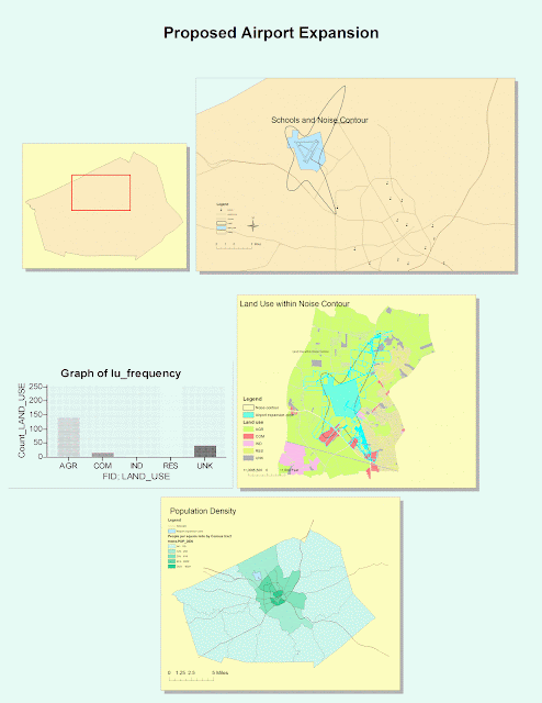
     This is the first time I have ever been introduced to GIS, and it has been a fun but time consuming experience for me. GIS has great potential in terms of its organization, different views, and various tools for different operations. It is very easy to organize different tables and maps onto one sheet of paper like what I did in the  picture above. The aligning function makes the page look very neat and organized. The layout view and date view we used in this lab are really helpful when we need to switch between part of a map and an entire sheet of organized maps. The different tools in the tool bar are also extremely helpful for all types of  purposes. Although I did not get to explore all of them, it is still clear that they are very efficient. For instance, the zoom function in the tool bar provides us a chance to look at the map in great detail, thus we can find small items that cannot be seen earlier. 
     
     GIS is also excellent in its variety of colors, styles, and its easy way of transferring data onto the maps. I was impressed with the large range of colors used for different features, different areas, and different purposes. It is very easy to identify each feature and different layers on the map just by the color. The color scheme if GIS also looks very pleasant to the viewers to make their map reading experience even better. There are different styles of text, icons, and symbols for us to choose from, which is very helpful since everyone has different opinions on styles. One can use these choices to create maps that best suits him. I also noticed that it is very easy to transfer a set of data onto the maps while I was completing the lab. This is a great advantage since many people use GIS to analyze data in certain fields. Overall, GIS has countless advantages and potential.

     Despite the great potential, I encountered a couple of problems while trying to follow the tutorial. The tutorial was out-of-date, which made it very hard for me to compare my screen to the tutorial example. Another problem I encountered was the fact that for some reason whenever I need to browse for an existing data, the program does not allow me to do so. Every time I need to browse for data, I have to go to the documents, search for its properties, and paste it onto the browse box. This becomes very tiring and it is easy for me to make mistakes by choosing the wrong data set. Despite these two little problems, I was overall satisfied and enjoyed my experience with GIS for the first time. 

     Last I am going to talk about the pitfalls of GIS. In my opinion, GIS is not very user-friendly comparing to other existing systems. Students outside of this class might not be able to access this system on their own. Even if they do, without the tutorial, it will be very painstaking to learn about the different tools and functions in the system. Therefore, it seems like GIS is only intended to be used within the field of geography, but not to the general public. Although this way its information is very accurate and professional, it might not be very popular towards the general public. Other than that, GIS is an amazing system for us to use to explore, analyze, and to present our maps to other viewers.